Cozy Master Bedroom Ideas
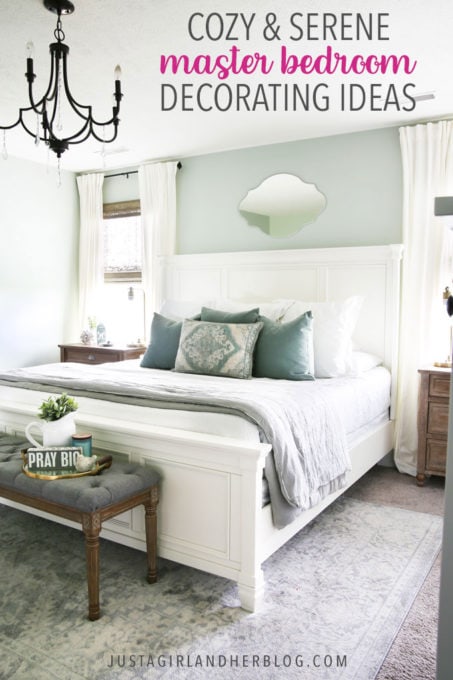
These cozy and serene master bedroom design ideas can serve as inspiration as you create your own beautiful bedroom! Calming colors, soft textiles, and simple accessories give this master bedroom a light, airy, and inviting feel!

Our master bedroom is finally complete! Admittedly, I finished about 90% of the space a few months ago, but then I totally dragged my feet on finishing out the final details. (Please tell me I'm not the only one who does this... 😉 )
My goal for this room was to create a cozy, serene, and relaxing space for Donnie and me to hang out in. I'm pretty sure we made that happen, so I'm calling it a win!
The Master Bedroom Before
This post contains affiliate links. For more information, see my disclosures here.
When we first moved into our house nearly three years ago, the master bedroom was just like all of the other rooms in the house-- a plain white box!

I added the absolute essentials but not much else, and at the one year mark of living in our house, the master looked like this:

We installed a light fixture right after we moved in because we thought it might be convenient to be able to see in this room. 🙂 We also purchased a bed because we had moved to a king-sized mattress from a queen. (And this comforter and quilt as well.)
I had chosen the side tables shown in the photo above to act as nightstands, but I quickly realized that the lack of storage in them caused the surfaces to get cluttered quickly. After a few months, I moved them into our guest room and started searching for a replacement for the master.
Our house was full of so many other projects that our bedroom got put on the back burner (typical!), but every once in a while I would add a piece or swap something out or paint or add some accessories. I'm so excited to show you what it looks like today!
Cozy Master Bedroom Design Ideas
One of the first things I think about when I start planning out a bedroom design (or design for any room!) is how I want the room to feel. When I was thinking about our master bedroom, I knew I wanted it to feel calm and soothing. It is a place to rest and relax, after all!
Creating a Soothing Color Scheme
One of the biggest components I used to create this feel in our room was the color scheme. Everyone will have a slightly different idea of what "calm" and "soothing" feel like to them, but I decided on a greenish aqua, along with lots of white, gray, and natural wood tones.

The wall color I ended up using is Sherwin Williams Sea Salt. It comes across as a soft green in our space most of the time, but it can definitely be a chameleon depending on the light and other colors near it.
In some lighting situations throughout the day, I've seen it look more like a gray, and occasionally it even pulls a bit minty! It was just the calming color I was looking for though, and I love how all of the white really pops against it.

Finding Pretty and Practical Nightstands
While creating our bedroom design, the pieces that took me the longest to track down-- by far-- were the nightstands. I think I looked at just about every nightstand on the internet!
After using drawer-less side tables as nightstands for a while, I knew I wanted something with storage. And since they were going to be placed right in front of the windows, I needed pieces that were decently wide, but not too tall. I also didn't want to spend an arm and a leg on them, but since they needed to be fairly large as far as nightstands go, this was a challenge!
Finally, finally, I found these beauties when they were on sale, and they checked all of the necessary boxes. I couldn't be more thrilled with them!
Pillows, Pillows, and More Pillows!
I may be just a smidge obsessed with pillows, so I got really excited when I found our beautiful center pillow at World Market, especially because the design on it it kind of mimicked the shape of the mirror I had chosen for above the bed. (Type A much? 😉 )
[I no longer see my exact pillow on World Market's website, but they do have the same design in this beautiful color scheme.]

I grabbed three inexpensive velvet pillow covers from H&M to sit behind the medallion pillow. Behind those, I used three Euro-sized pillows with simple white shams, and our regular sleeping pillows are behind the Euros, propping everything up.
I warned you that I was a bit pillow obsessed!!
Choosing Decor for a Large Wall
Of all decor decisions, wall decor tends to be the hardest for me. I just really struggle to find pieces that I love that fit into the scheme I'm going for.
I learned a long time ago that I prefer one or two large pieces to fill space on a big wall, rather than a bunch of smaller pieces because it feels less cluttered to me. (Totally a personal preference thing!) So I grabbed these arched windows + mini wreaths to use on our far wall.

Rather than hanging more items on the wall to fill the rest of the wall space, I used a tall floor lamp and a leaning full-length mirror. They seemed to do the trick!
Add a Cozy Reading Nook
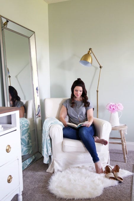
I love little reading nooks and have several of them set up in our house, so naturally I was giddy when I figured out that I could fit a little chair and side table in this corner.

I think that bringing in a cushy chair, pillow, and throw adds to the cozy feel of the space. It's also nice to have a spot to sit to put on our shoes, read, or just hang out and chat.

Decorating Around a TV
Another dilemma I had when decorating this space was how to "camouflage" the TV.
I ended up going with a "less is more" strategy again, just bringing in a faux plant for some interest and hanging a simple sign above.

I stumbled across this sign right when I had finished Ann Voskamp's 1000 Gifts Devotional, which is all about giving gratitude to God in all things, and I love having the reminder to be grateful each and every day!

The "TV stand" is also Donnie's dresser and used to be blue! I gave it a little makeover so it would fit in better with the rest of the room-- you can see the details in this post.
Choosing Final Bedroom Design Details
The final little wall of the room holds my dresser, which is the IKEA HEMNES 6-drawer chest in white stain. The two simple frames hold family photos. At one point I realized that I had unintentionally removed nearly all of the family photos from our house, so I'm trying to add them back in wherever I can!

(The door to the left of my dresser leads to our master bathroom and closet. The door to the right of the dresser goes to the upstairs hallway.)

So that's our room! It may have taken me a while to pull together, but I am thankful that Donnie and I finally have a calm and cozy space where we can relax!
Here's a little "before and after" shot...

I love it when a plan comes together!
Thinking about using some of these ideas in your own space? Be sure to pin the image below so you can easily find this post later!

Sources
You can find sources for all of the items we used in our master bedroom by clicking on the images below.
Looking for more bedroom design inspiration? These posts should be helpful:
Sweet and Simple Guest Bedroom Decor
Townhouse Master Bedroom
"Let's Go Adventuring!" Shared Kids' Bedroom
Shared Kids' Townhouse Bedroom
Have you made any updates to your master bedroom lately? I'd love to hear about them in the comments below!
Thanks so much for following along! Have a wonderful day!

This post contains affiliate links. For more information, see my disclosures here.
Source: https://justagirlandherblog.com/master-bedroom-design-ideas/
